


This case study outlines the conversion rate optimization (CRO) strategy for Viome, a direct-to-consumer health-tech company. In response to record-low sales following a shift away from a promotional pricing model, the primary challenge identified was a confusing user experience; customers struggled to understand the core product, differentiate between packages, and navigate a complicated purchasing flow.
As the UI/UX designer, I led the redesign of key homepages, product pages, and the quiz experience to bring clarity to the product's value proposition. Due to low site traffic making traditional A/B testing inconclusive, we adapted our approach to measure success through leading engagement metrics like click-through rates and interaction data, supplemented by qualitative user interviews. The goal was to reduce friction and build user confidence, creating a more intuitive and informative path to conversion.
An initial audit revealed that the user experience was a primary blocker to conversion. The product itself was confusing and hard to understand for many users. The core product offering was difficult to grasp, the various packages and upsells were not entirely clear, and the overall customer journey was complicated, creating high friction and drop-off.
As a UI/UX Designer focused on conversion rate optimization (CRO), I was tasked with redesigning these key pages (homepages, product pages, and the quiz flow) to improve user understanding and drive sales. The project's central challenge was that users were attracted to Viome's promise of personalized health insights, but the current website experience created significant barriers to purchase.
My central hypothesis was that by clarifying the product's value proposition, simplifying the package selection process, and creating a more intuitive user journey, we could reduce user confusion and increase engagement.
The primary goal was to increase the overall conversion rate. However, due to low site traffic and low revenue leading to the client dropping the partnership, reaching statistical significance on A/B tests was not consistently feasible. To adapt, we expanded our success metrics to include leading indicators such as click-through rates (CTR) on key CTAs, on-page interaction rates with new modules, and qualitative insights gathered from user interviews.

The execution of this project followed a rapid, iterative CRO process focused on speed, efficiency, and continuous learning, built upon a foundation of strategic research and a robust design system.
Initial discovery focused on identifying key friction points and developing a data-backed strategy:
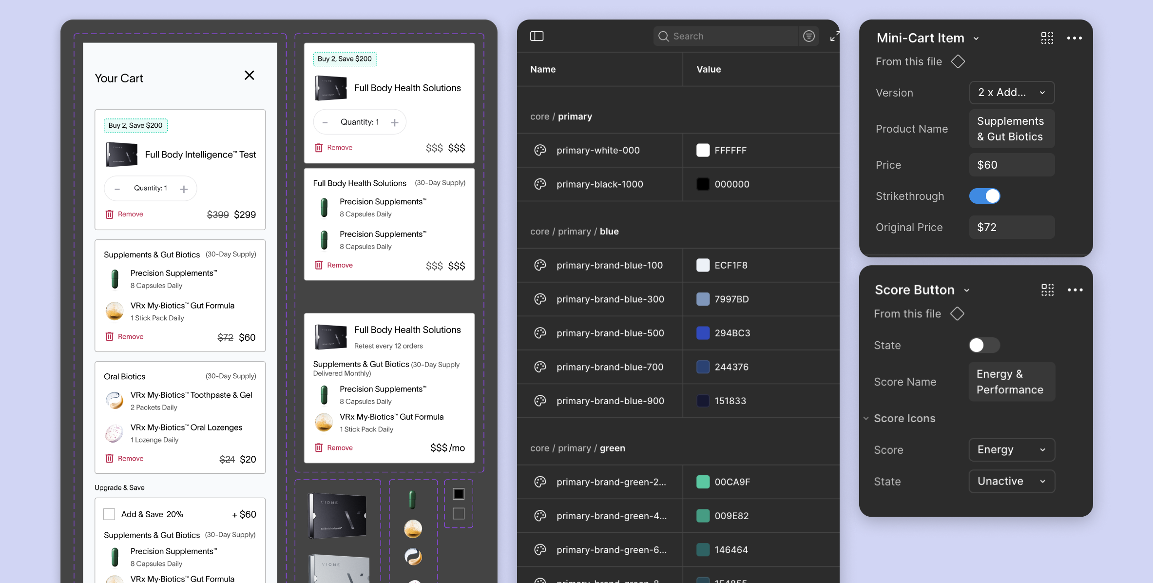
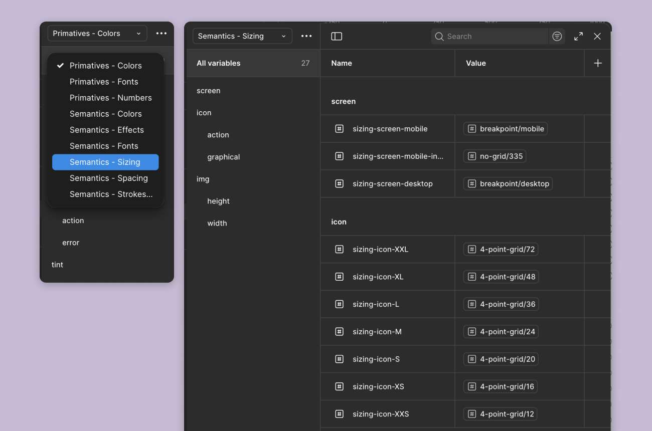
To ensure speed and consistency across a variety of page and quiz tests, a significant foundational step was the creation of a robust design library:
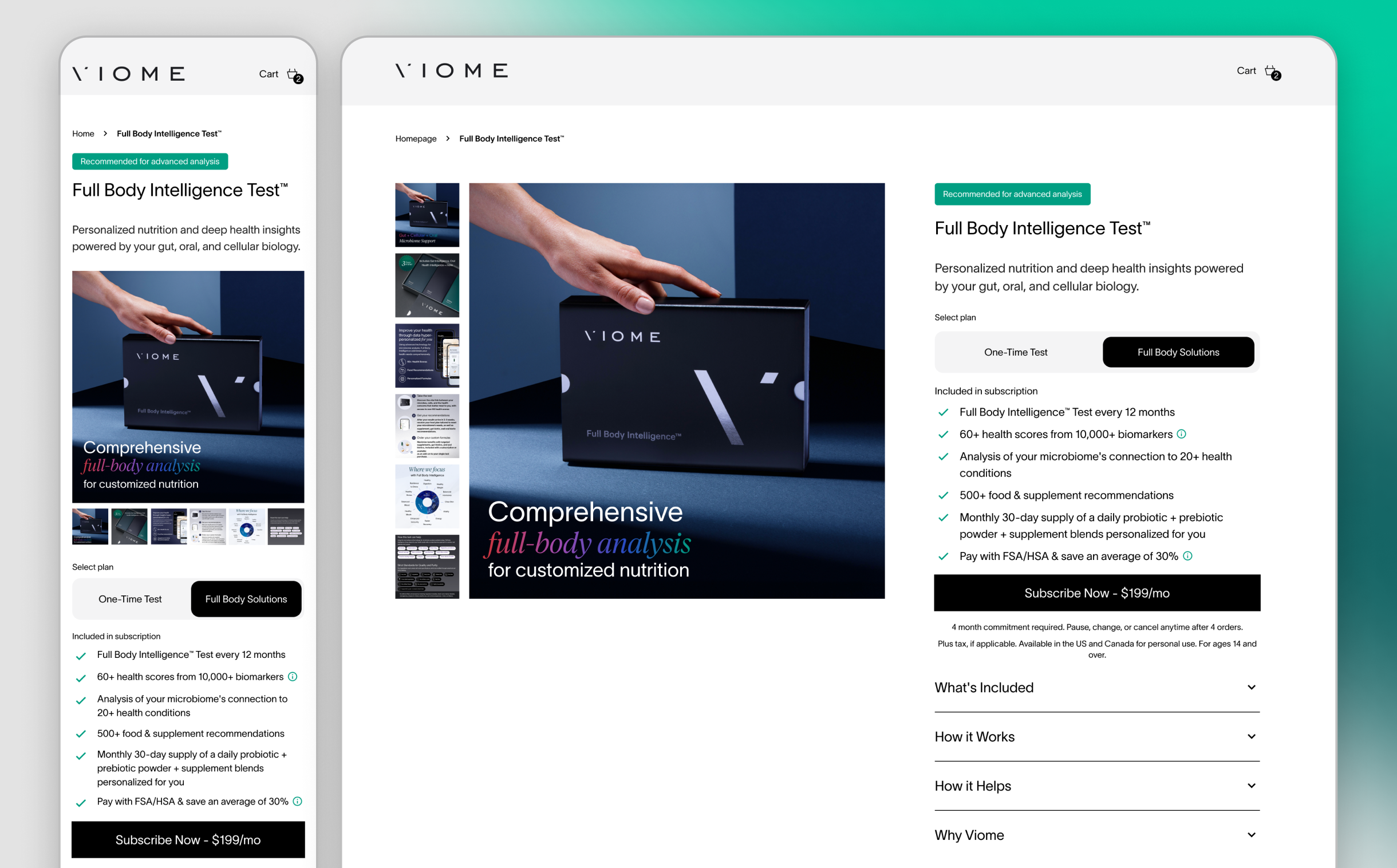
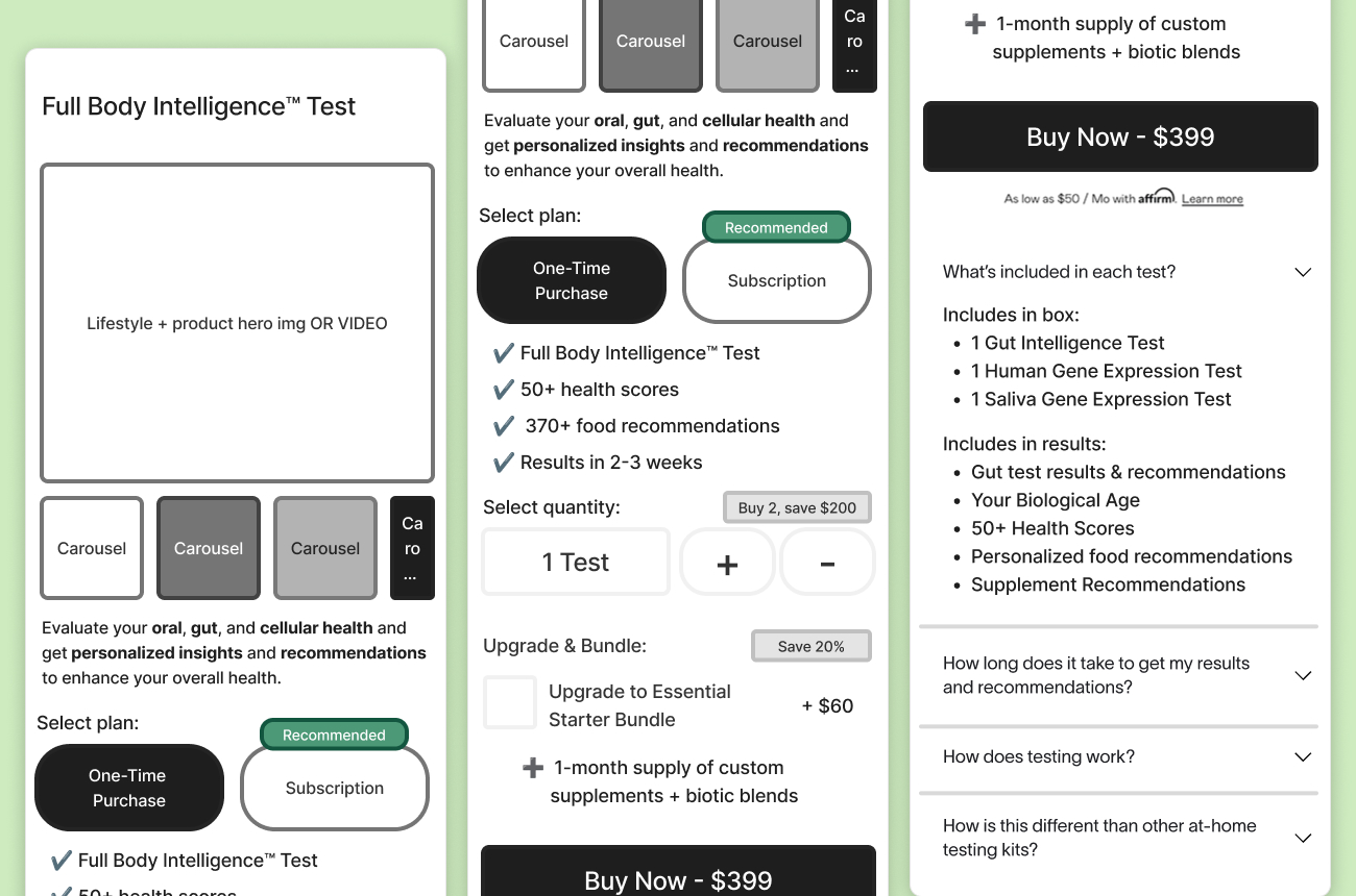
Design iterations focused on simplifying the complex user flow, informed by qualitative insights:

While the project was ultimately curtailed due to the client's internal revenue challenges and low traffic, the engagement successfully validated the core design hypotheses and established a highly efficient design and development framework.
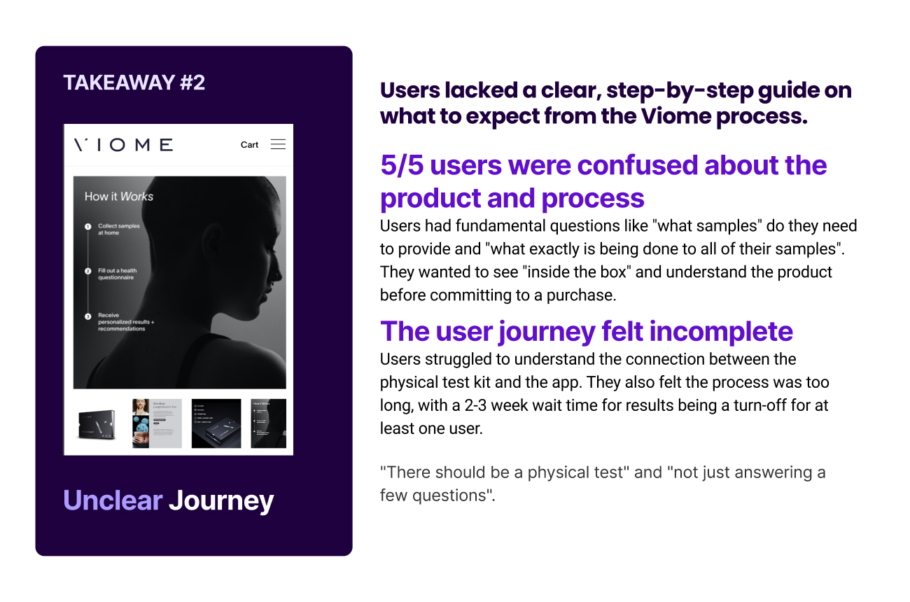
Post-launch qualitative user research provided compelling proof points that validated the redesign efforts:
A major success of the engagement was the establishment of a robust design system that transformed the product team’s speed and quality of delivery.
The project reinforced a critical lesson in designing for complex health-tech: users must understand the 'what' and 'how' before they can appreciate the 'why' (value). The success of the foundational work—both in qualitative validation and in technical efficiency—established a high-potential framework for future conversion gains, proving the validity of the hypothesis and the effectiveness of a robust design process.
